Over the last few days I’ve been transmitting WSPR on 40m with 20dBm of power using my Hermes-Lite 2.0beta2. For this, I’m using the instrument output of the Hermes-Lite, which is driven by an OPA2677 200MHz dual opamp that produces a maximum output of 20dBm. I’ve been transmitting always on the frequency 7040100Hz. I have been collecting the reports from the WSPR database for a total of 2518 reports over 5 days of activity.
There are many statistics that can be done with this data, but since I have always been transmitting on the same frequency, it is quite interesting to look at the frequency in the reports. My Hermes-Lite is quite stable in frequency, as it uses a 0.5ppm 38.4MHz TCXO from Abracon. In fact, in the shack its stability is usually much better than 0.5ppm. During these tests I have verified the accuracy of the Hermes-Lite frequency by receiving my DF9NP 27MHz PLL, which is driven with a DF9NP 10MHz GPSDO. The 27MHz signal is usually reported around 3Hz high by the Hermes-Lite, with a drift of roughly 0.3Hz. This accounts for an error of 0.1ppm, and the drift is around 10ppb.
It seems that this performance is much better than the usual performance of the Amateur radio transceivers that report on the WSPR network, so the frequency reports can be used to measure the error of the frequency references in these Amateur radio transceivers. Noting that at 27MHz my Hermes-Lite is 3Hz low in frequency, I have determined a correction of -0.782Hz for my WSPR frequency, so I have chosen to take my transmission frequency as 7040099.218Hz when doing the calculations. This is probably accurate to a few tens of ppb.
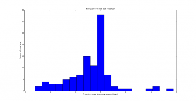
I wanted to do a statistic of the distribution of the error in the frequency references of the WSPR receivers. To do this, I’ve decided that it’s better to first do, for each reporter, an average of the frequency of its reports, and then take this average as the frequency measured by that reporter. Then I do a histogram of the errors in the frequency reported by each reporter. The first average is done because there are some reporters which have a great number of reports with a very similar frequency (because their receiver might have an error, but it doesn’t drift much), and so the histogram would be biased with these reports if I just plotted the histogram of all the frequency reports. The histogram is shown below.

I find this histogram rather surprising. I expected to get a normal distribution or something similar, or at least a symmetric histogram centred on an error of 0ppm. However, the histogram is clearly skewed to the left. We conclude from this that a good number of WSPR receivers are quite accurate in frequency, and have an error of 0.5ppm or less. However, from those that are not accurate, it is much more probable that they are low in frequency (so they report me at a higher frequency).
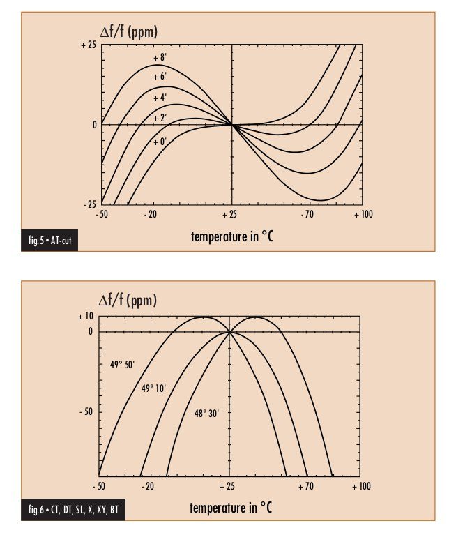
I still have to find a good explanation for this effect. However, I have suspicions that this has something to do with the way that the frequency of a quartz crystal depends on the temperature (and this depends on the way that the crystal is cut). I have found in this document the image below.
Note that non-AT-cut crystals are low in frequency over most of the temperature range, so I can’t help but think that this is too much of a coincidence with the skew in my histogram above. Other people have pointed out that this is not so simple, as for instance the adjustment of the tuning capacitors of the crystal oscillator also plays an important role. It would be good to repeat this test in other bands and by other stations, perhaps in other parts of the world (my reporters come from Europe) and see if they also obtain a skewed histogram.
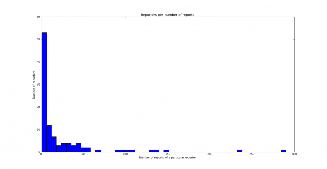
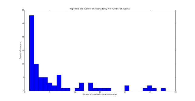
As an indication of the statistical significance of this test, I can say that a total of 2518 reports coming from 104 different reporters have been used. Just looking at these numbers is very far from doing a proper hypothesis contrast, but it is indicative that I have used a good amount of data. It is also interesting to look at the distribution of the number of reports given by each reporter. This is shown in the two histograms below (first for all numbers of reports and then for 30 reports and less).
The Python script and data used in this post are in this gist.


