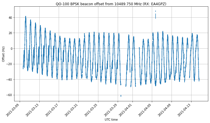
A few days ago, the spring eclipse season for Es’hail 2 finished. I’ve been recording the frequency of the NB transponder BPSK beacon almost 24/7 since March 9 for this eclipse season. In the frequency data, we can see that, as the spacecraft enters the Earth shadow, there is a drop in the local oscillator frequency of the transponder. This is caused by a temperature change in the on-board frequency reference. When the satellite exits the Earth shadow again, the local oscillator frequency comes back up again.
The measurement setup I’ve used for this is the same that I used to measure the local oscillator “wiggles” a year ago. It is noteworthy that these wiggles have completely disappeared at some point later in 2020 or in the beginning of 2021. I can’t tell exactly when, since I haven’t been monitoring the beacon frequency (but other people may have been and could know this).
A Costas loop is used to lock to the BPSK beacon frequency and output phase measurements at a rate of 100 Hz. These are later processed in a Jupyter notebook to obtain frequency measurements with an averaging time of 10 seconds. Some very simple flagging of bad data (caused by PLL unlocks) is done by dropping points for which the derivative exceeds a certain threshold. This simple technique still leaves a few bad points undetected, but the main goal of it is to improve the quality of the plots.
The figure below shows the full time series of frequency measurements. Here we can see the daily sinusoidal Doppler pattern, and long term effects both in the orbit and in the local oscillator frequency.
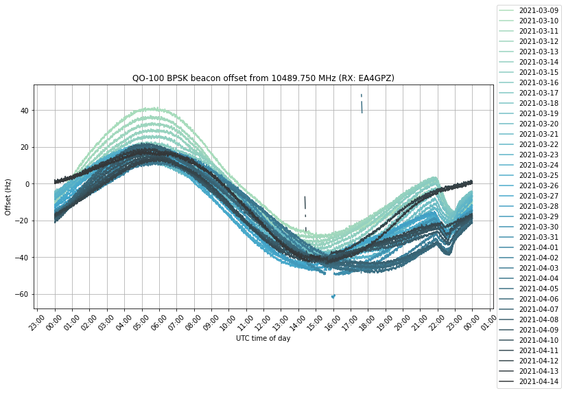
If we plot all the days on top of each other, we get the following. The effect of the eclipse can be clearly seen between 22:00 and 23:00 UTC.
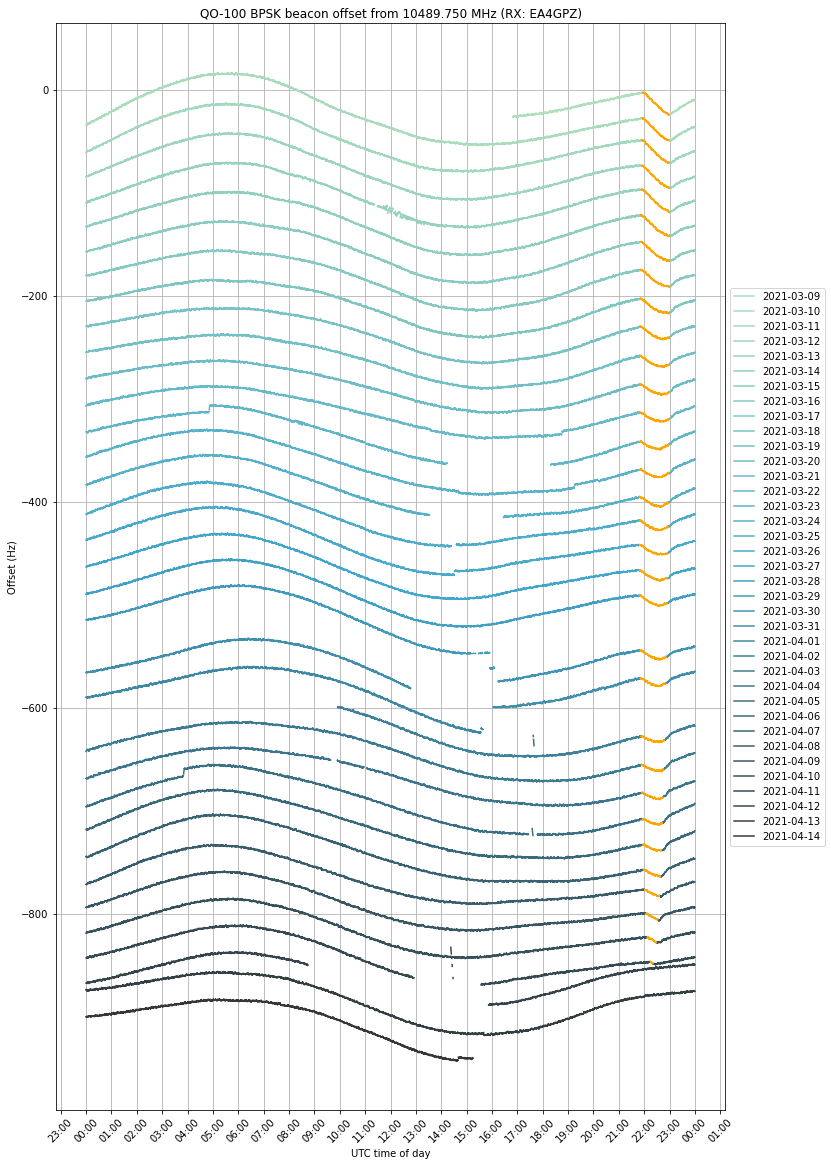
By adding an artificial vertical offset to each of the traces, we can prevent them from lying on top of each other. We have coloured in orange the measurements taken when the satellite was in eclipse. The eclipse can be seen getting shorter towards mid-April and eventually disappearing.
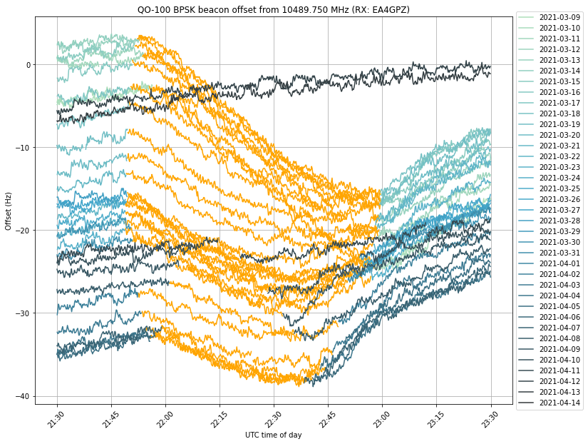
We see that the frequency drop starts exactly as soon as the eclipse starts. In many days, the drop ends at the same time as the eclipse, but in other days the drop ends earlier and we can see that the orange curve starts to increase again near the end of the eclipse. This can be seen better in the next figure, which shows a zoom to the time interval when the eclipse happens, and doesn’t apply a vertical offset to each trace. I don’t have an explanation for this increase in frequency before the end of the eclipse.
The plots in this post have been done in this Jupyter notebook. The frequency measurements have been stored in this netCDF4 file, which can be loaded with xarray.
One comment