A few days ago, I posted about a recent wildfire in Tres Cantos, Madrid, Spain, sharing images of Pléiades Neo and Sentinel-2 that showed the extent of the fire. Since the Sentinel-2 data products can be downloaded for free and they include multispectral data covering 13 bands including visible, near infrared and short wave infrared spectrum, I have decided to do an analysis of this data. There are two main goals to this. The first is to learn. I have never done this before. It is an interesting topic, and I mostly learn by doing. So bare with me that although all my results seem to make sense, I could have made some mistakes or done something in a suboptimal way.
The second is to understand how badly the holm oak woodland in “Monte de Viñuelas” has been burnt. In the previous post I explained that this is a 30 km² estate and that a large part of it has been hit by the fire. From the wall that borders the estate I can see that the oaks that are near the wall have not burnt, but the grass in the ground has burnt completely. The leaves on these oaks are mostly fine. Some of them might wither with time if the fire has killed the tree (in some previous smaller fires I have seen that if the fire has killed only part of the tree, just that part will wither). Here are some images published by a hunting journal showing how some of these areas look like a few days after the fire.
However, deeper into the woodlands there seems to be more damage and trees burnt completely. This is not so easy to see from the wall, and I cannot just walk in, as it is private land. Aerial photography would be best, but without it, satellite imagery is the next best thing. It is hard to tell how large the damage is from the visible spectrum imagery, but as we will see in this post, the infrared bands have much more information.
Sentinel-2 bands
The first thing to understand is which are the 13 bands captured by Sentinel-2. These are depicted in the following graph, taken from this website.
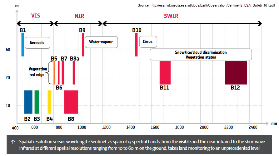
Bands are depicted according to their wavelength in nm and bandwidth. Different bands have different resolution: either 10 m/px, 20 m/px or 60 m/px. This is shown in the y-axis of the graph.
An interesting way to put these spectral bands in context is to compare them with the atmospheric transmission. The following plot, taken from this forum post, shows the spectral response of each of the bands and the atmospheric transmission. Parts shaded in blue are highly attenuated by the atmosphere.
We see that most of the bands lie in regions of high atmospheric transmission. For instance, bands B11 and B12, which are the main short wave infrared bands lie in two short wave infrared transmission windows. Between them there is a water absorption line at 1900 nm.
Bands B10 and B9 lie in absorption lines of water, however. Band B10 is used to detect cirrus. Radiation received in this band must come from reflection on cirrus high in the atmosphere, since the atmosphere is opaque in this band. Band B9 is intended for water vapour measurement. Band B8A is used as a reference band for this measurement. It has the same bandwidth and it is close in wavelength, but it lies in a transmission band not attenuated by water. Therefore, the quotient B9/B8A indicates attenuation by water vapour.
Band B8 is the main near infrared band. It has a broad bandwidth and high resolution, and it is contained in a transmission window, except for some partial absorption by water in the middle of this window. Bands B5, B6, B7 are narrowband near infrared bands that are used for vegetation red edge measurement. I will describe this in more detail below.
Bands B2, B3, B4 are visible spectrum bands, corresponding to blue, green and red. Band B1 is a narrowband visible band near the blue end of the visible spectrum. It is used to detect aerosols, and it can also be used to estimate suspended sediment in the water.
Vegetation reflectance
We are all familiar with the concept that healthy vegetation is green and dry vegetation is yellowish or brown, but if we also consider infrared, this doesn’t paint the whole picture. The following plot shows the reflectance of healthy and dry vegetation across the visible, near infrared and short wave infrared spectrum, as well as the physical processes that cause this spectrum.
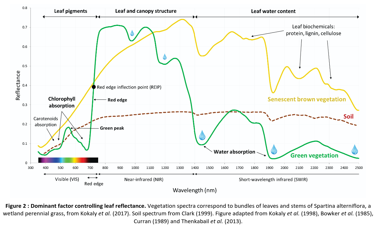
In the visible spectrum, chlorophyll absorbs red and blue wavelengths. There are other pigments such as carotenoids that absorb blue wavelengths as well. The consequence is that healthy vegetation appears green simply because there is less absorption in the green wavelengths.
Chlorophyll suddenly starts being transparent near the beginning of the near infrared spectrum, in a zone know as red edge, which is around 700 nm. The cellular structure of plants is a very good reflector of near infrared radiation, so the reflectance of healthy vegetation in the near infrared spectrum is very high. The transition from high absorption of red wavelengths to high reflectance of near infrared is very steep. The inflection point of this transition, know as Red Edge Inflection Point (REIP) can be used to monitor plant health and to distinguish different types of vegetation. Sentinel-2 includes three spectral bands B5, B6, B7 in the red edge zone that can be used to estimate the REIP and perform other studies related to vegetation. Band B8 is also important for vegetation studies, as it captures the high reflectance on the near infrared.
Water content in healthy plants also causes the same water absorption lines that we have seen in the atmosphere. These absorption lines in vegetation cannot be observed from space, due to the atmosphere absorption, but they are relevant for terrestrial and aircraft studies. In the two transmission bands in the short wave infrared, which correspond to Sentinel-2 bands B11 and B12, the reflectance of healthy vegetation is relatively low, partly due to water content.
In comparison, in dry vegetation chlorophyll has been destroyed, so there is less absorption on blue and specially on red wavelengths. This is what gives its colour to dry vegetation. Reflectance in the beginning of the near infrared band, around 800 nm, which corresponds with the Sentinel-2 B8 band, is lower than for healthy vegetation, in part because of the deterioration of the cellular structure. The transition between relatively low reflectance in the visible spectrum and the higher reflectance in the near infrared is much shallower, due to the lack of chlorophyll.
Water content in dry vegetation is lower, so there is less absorption in the water absorption lines. In the Sentinel-2 short wave infrared B11 and B12 bands the reflectance can be higher than that of healthy vegetation, partially because of the lower water content.
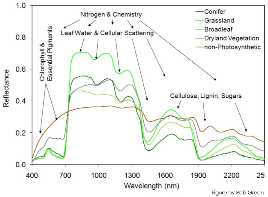
The figure below shows the spectrum of different types of vegetation, including dry non-photosynthetic vegetation. We see that the infrared reflectance can depend on the type of plants, with grass generally having the largest reflectance.
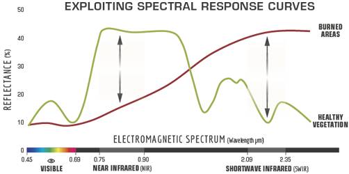
The infrared spectral response of vegetation can also be used to detect areas burnt by fire. In the visible spectrum, burnt areas have much lower reflectance. As we all know, burnt things are mostly black. In the near infrared, the reflectance of burnt areas highly decreases. The cellular structure of burnt vegetation is destroyed and can no longer act as an efficient infrared reflector. As we move into the short infrared spectrum, the reflectance of burnt areas is higher than that of healthy vegetation, since water has been lost. This suggests that the comparison of the reflectance on the near infrared B8 band and the short wave infrared B12 band can be used to detect burnt areas. Formalizing this more gives the Normalized Burn Ratio, which is one of the spectral combinations that we will use below.
Sentinel-2 data
In this post I will be using the following two Sentinel-2 L2A datasets:
S2A_MSIL2A_20250810T110701_N0511_R137_T30TVK_20250810T151608.SAFE.zipS2B_MSIL2A_20250813T110619_N0511_R137_T30TVK_20250813T133147.SAFE.zip
Recall that the fire started on 2025-08-11 17:45 UTC, and was deemed to be completely extinguished in approximately 36 hours, so the first dataset is from the day before the fire, and the second dataset is after the fire was extinguished. Both of these datasets can be retrieved from Copernicus Browser.
I have used ESA SNAP 12.0.0 for data processing. Since SNAP is a GUI application intended for interactive data processing and visualization, unfortunately I don’t have an easy way to share my work in a way which makes it trivial to replicate (as opposed to when I use a Jupyter notebook for data processing). Hopefully the discussion below will be enough so that interested readers can replicate the results on their own starting from the same datasets.
First I have cropped the relevant area of the datasets by using the Spatial Subset From View option. Then I have resampled all the bands to 10 m/px by using Raster > Geometric > Resampling, since I will be doing combinations of bands with different resolution. In order to perform band maths between bands on each of the two datasets, I have needed to use the Raster > Geometric > Collocation option to include all the bands into a single dataset. I am wondering why I have needed to do this, since the tutorial I was following for NBR calculation doesn’t have this step. It appears that there is something slightly different about the geometry of these two datasets that requires a collocation to be done.
Initial analysis
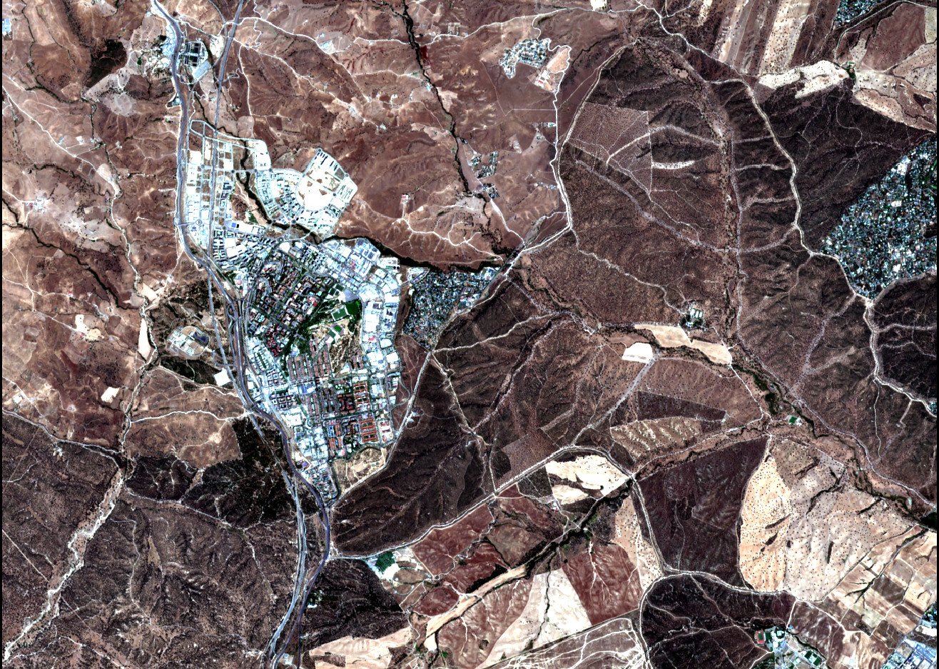
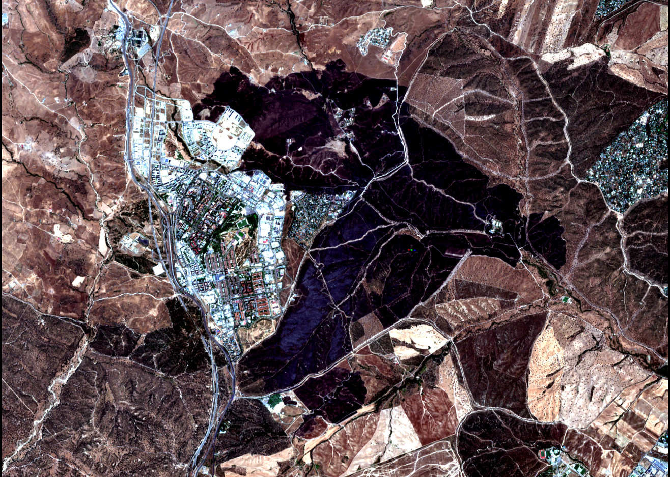
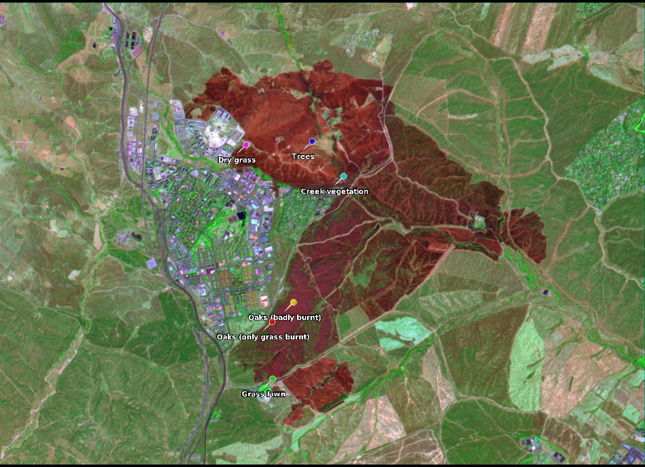
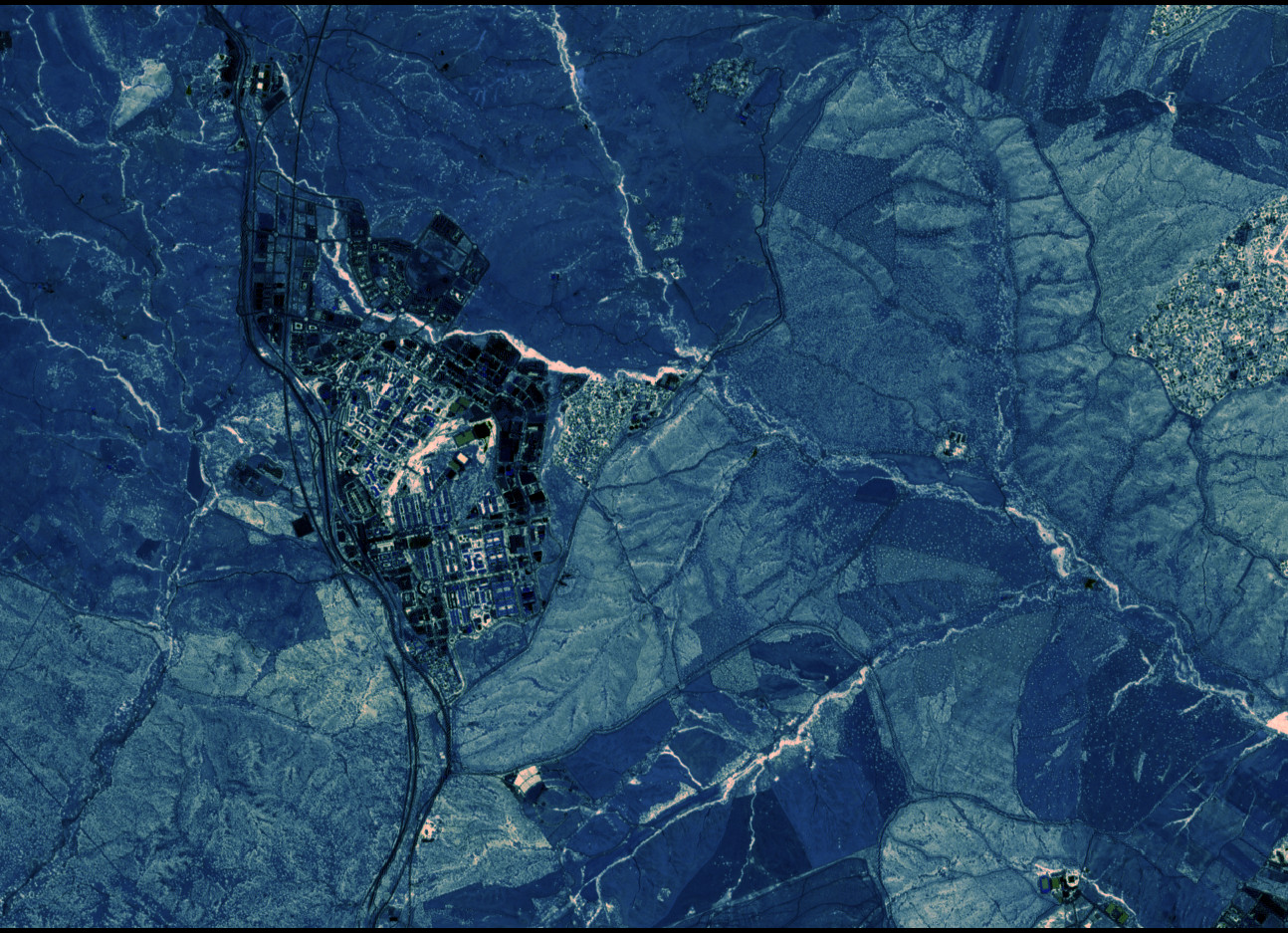
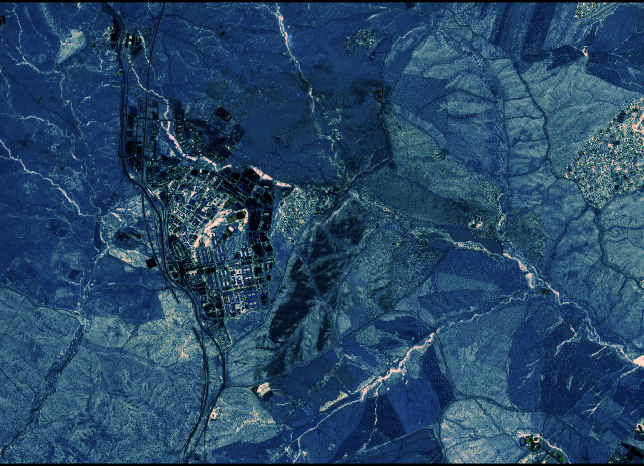
The following images show an RGB plot of the bands B4, B3, B2, which correspond to red, green and blue. Therefore, this is a true colour view. These images are quite similar to those I showed from Copernicus Browser in the previous post, but however there is no fancy image processing that takes into account the peculiarities of human vision. All that SNAP is doing is to map the reflectance in B4, B3 and B2 to red, green and blue, and scaling to an appropriate range in each channel while maintaining a reasonable white balance. In order to allow the comparison of the images, I have copied the scaling of the RGB channels for the first image onto the second one.
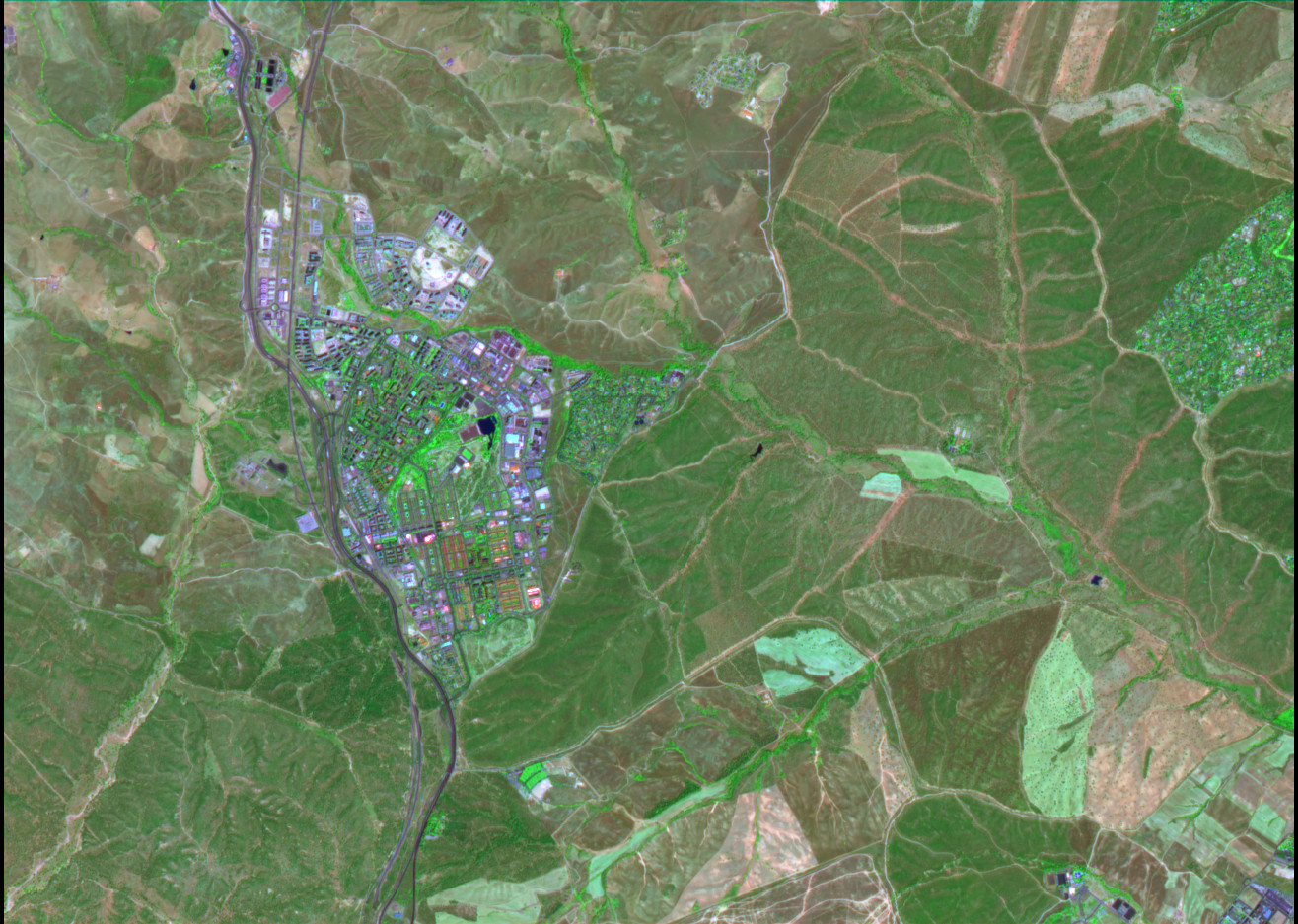
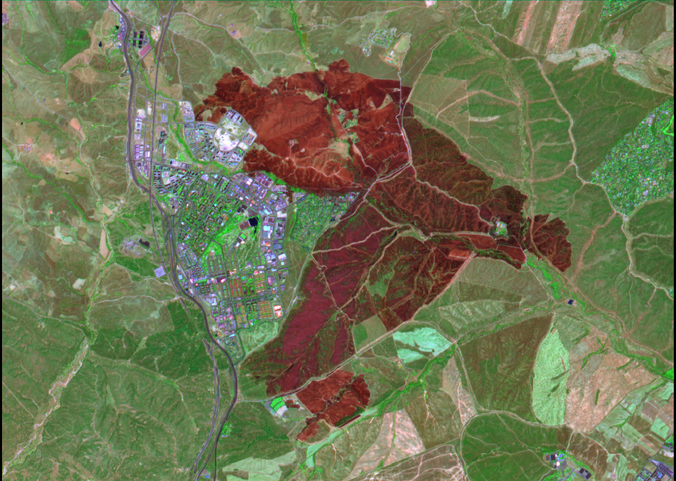
Above we have seen that the B8 and B12 infrared bands contain useful information about vegetation and burnt areas. It makes sense to make a false colour representation using these two bands. We will represent B8 as green, since healthy vegetation has high reflectance in B8, and displaying vegetation in green matches our intuition. The reflectance in B12 is related to dryness, since water content causes attenuation in this band. So we can represent B12 in red, to help our intuition. Finally, we pick one visible band, representative of visible reflectance. We choose B3, which is the colour green, but represent it in blue. This RGB representation using B12, B8 and B3 also has the advantage that it is like a version of our RGB vision stretched to cover short wave infrared and near infrared. Bands of longer wavelengths are mapped to colours of longer wavelength.
The following image is before the fire. The band B8 makes the presence of vegetation much more apparent than in the true colour image. Creeks, which have higher vegetation density surrounding them, stand out. We can also see bright green colours in large enough grass surfaces. These are the lawns in the La Paz Alocobendas cemetery, the Rugby / American football field in Tres Cantos, and a golf course in the Ciudalcampo development. It is also fun to see how some football fields that appear green in the true colour image are actually made of artificial grass and they appear black or dark brown in this false colour image. Another area of relatively dense healthy vegetation is the Central Park in Tres Cantos.
In the image after the fire we can see that the burnt area appears bright red due to an increase in reflectance in the B12 short wave infrared band (the two images use the same colour scale for each of the RGB channels). Vegetation destroyed by the fire no longer appears green. However, we can still see some patches of green in the red area. In principle these correspond to vegetation that the fire was not able to burn completely. There are such patches in the Monte de Viñuelas oak woodland, particularly near the wall that is adjacent to Tres Cantos, where I have been able to see that the oaks haven’t been burnt. There is also some vegetation along creeks that seems to have survived the fire.
In the rest of the post I will use some band combinations and indices that are commonly used in remote sensing in order to investigate in more detail the damage caused by the fire.
Short wave infrared reflectance difference
In the above we have seen that fire should increment the reflectance on the short wave infrared bands due to the decrease in moisture. We should investigate if this is true in our datasets. The following figure shows the difference in reflectance in the B11 band, comparing the 2025-08-10 and 2025-08-13 datasets. Blue means that the reflectance has decreased. Red means that the reflectance has increased. White means that it has stayed the same.
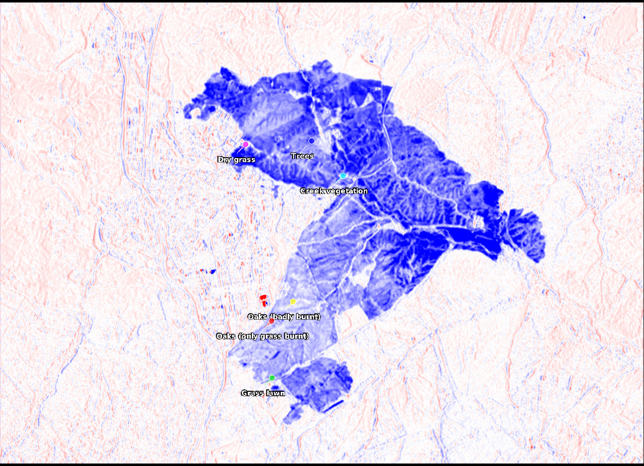
Unexpectedly, the reflectance in B11 has decreased after the fire in all the affected area. Some areas show a large decrease, while others show only a smaller decrease, but the burnt area is clearly seen all in blue. I don’t know what is the reason for this. Maybe the type of soot produced by this fire has high absorption in the B11 band, in the same way that it has high absorption in the visible and near infrared bands, and so it appears black. Maybe moisture reduction, which would increase the reflectance, plays a minor role because the area was already quite dry before the fire.
Another potential reason that comes to mind is that water dropped by firefighters will increase the moisture (there were some helicopters dropping water on the fire). However, the area in blue seems to delineate quite precisely everything that has burnt so as to be caused by water dropping, which would be focused on areas of heaviest fire activity. There is also a notion of scale: it would take a huge amount of water to significantly increase the moisture over such a large area.
Something else that can be noticed in the image above is that there are some artefacts all over the image. They appear as parallel red and blue lines following high-contrast terrain features in a predominantly vertical direction. Perhaps these are caused by a difference in illumination angle, or by a co-registration error. Another artefact that can be seen is that there are some very bright red and blue spots in the city. These correspond to highly reflective metallic rooftops. Their reflectance measurement depends greatly on the scattering angle.
There are some pins in the above image. They correspond to some particular areas for which I will study their spectra in detail.
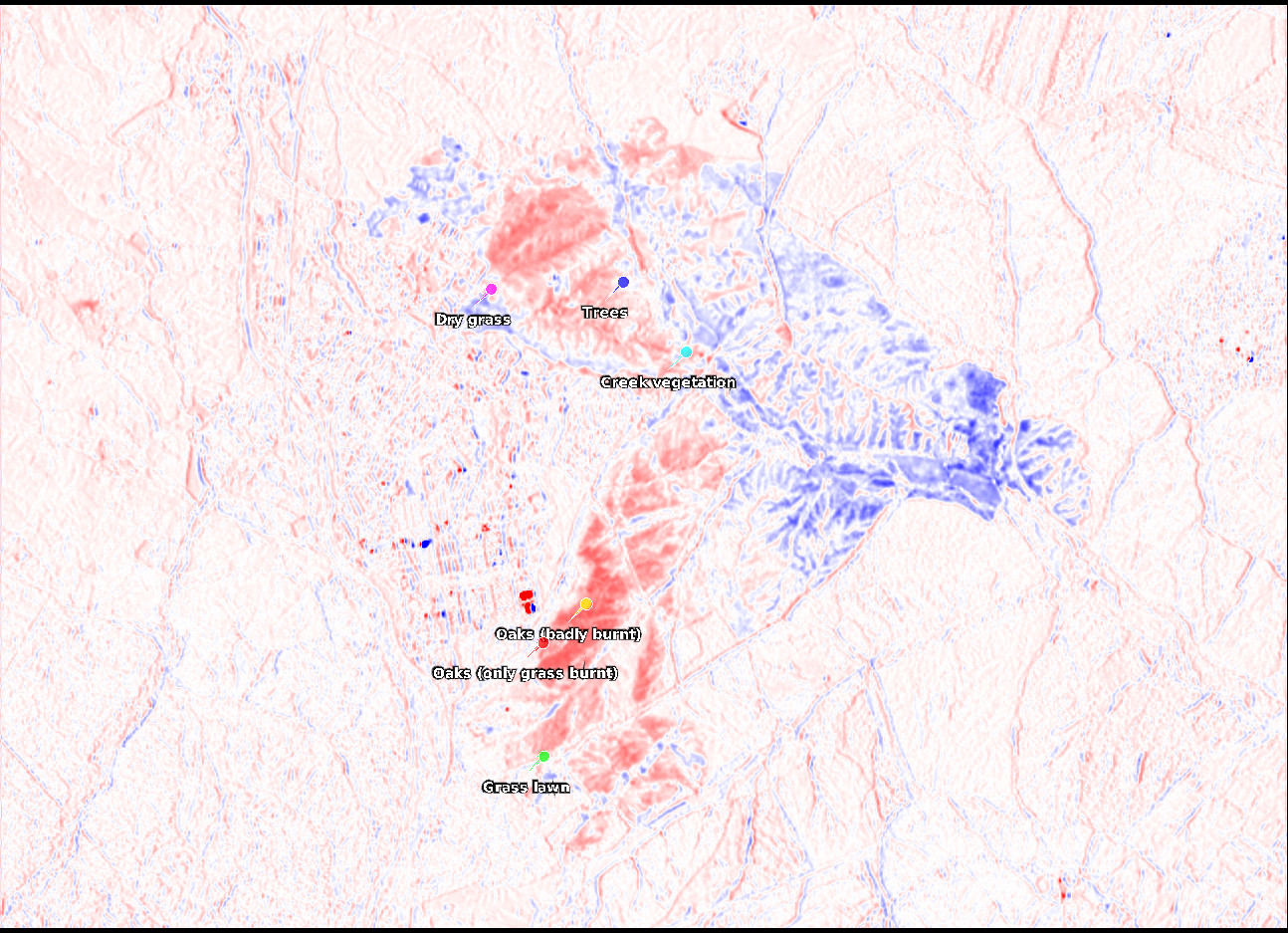
The next figure shows the difference in reflectance for the B12 band. The colour scale is the same as for the previous plot. Interestingly, the B12 reflectance has increased in part of the fire area, but it has decreased in other parts. Concretely, areas which were dark blue on B11 are light blue on B12, while areas that were a lighter blue on B11 are red on B12. The behaviour in this band might still be an effect of soot reducing the reflectance and dryness increasing it, but with different weights than in B11. The oak woodland that appears to be badly burnt is the area in which B12 reflectance has increased the most.
Spectra
Let us now study the spectra of a few different areas to see how they have been affected by the fire.
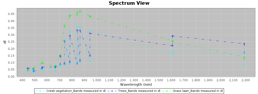
I haven’t found a great way to compare the spectra from before and after the fire in SNAP. What I will be showing is the SNAP spectra for the collocated data product, which contains the data from before and after the fire in different bands of the same wavelength. Therefore, in each wavelength we get two data points. It is reasonably easy to tell which corresponds to before the fire and which corresponds to after the fire, and to mentally draw the curves for the data points before the fire and after the fire. Reflectance has decreased after the fire in all the bands, except in B12, for which we need to refer to the plot above.
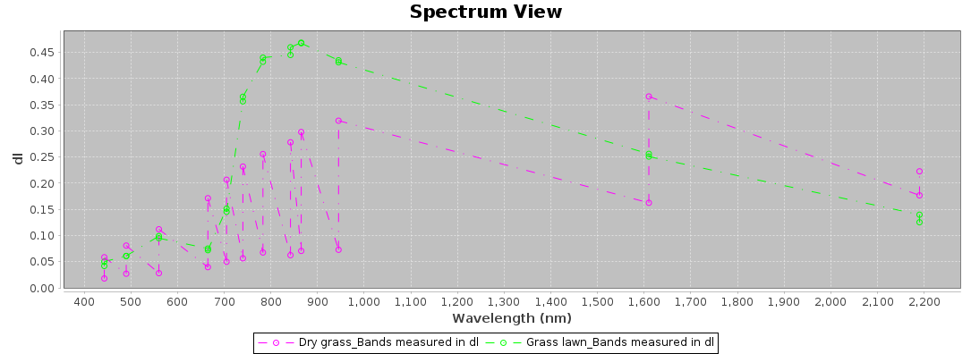
The first plot considers healthy green vegetation that has been badly burnt by the fire. A grass lawn that hasn’t been affected by the fire is shown for reference. The other traces show some vegetation around a creek (which includes large trees) and a dense group of small trees and shrubs in a valley in the middle of a dry pasture. In the near infrared we see very similar behaviour for these two types of vegetation. In the short wave infrared the trees have higher reflectance than the tree vegetation before the fire, probably due to a lower moisture level. After the fire, the B11 reflectance of the creek vegetation only decreases slightly, while the reflectance of the trees decreases more. Both the creek vegetation and trees have a large increase in B12 reflectance.
The next figure shows the spectrum of a field of dry grass before and after the fire. The same spectrum of a green grass lawn is shown for comparison. Before the fire the spectrum is the characteristic of dry vegetation. Reflectance increases steadily over the visible and near infrared spectrum. In B11 reflectance is very high, probably due to a low moisture level. Reflectance in B12 is lower, similar to the trees. After the fire, reflectance in the visible and near infrared greatly decreases. Reflectance in B11 decreases greatly, and in B12 it decreases slightly.
The next plot shows the spectra of two different parts of the oak woodland in Monte de Viñuelas. The yellow trace corresponds to an area deep in the woodland in which the oaks appear to have been burnt completely in this imagery. The red trace corresponds to an area near the border of the woodland, in which the oaks are visibly not burn and only the dry grass might have been affected by the fire. The two traces before the fire are very similar. The oaks have the characteristics of healthy vegetation, but their red edge and near infrared reflectance is not as prominent as for greener vegetation. The green peak in the visible is very small, since these oaks are greyish dark green in colour.
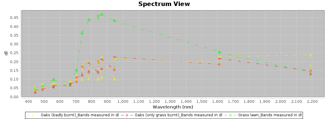
After the fire, there is a noticeable difference in the two spectra. The oaks that have been badly burnt have much lower reflectance in the near infrared. There is still a small red edge visible in the oaks near the border of the woodland. Reflectance in B11 has dropped slightly, and it is very similar in both cases. There is a large difference in reflectance in B12. For the badly burnt oaks it has increased significantly, while for the oaks near the border of the woodland it remains the same.
The comparison of these two spectra shows us that despite the looks of the visible spectrum imagery, the effects of the fire on the Monte de Viñuelas woodland might not be so bad and there are some areas where the trees might have not burnt (don’t get me wrong, though; the effect of the fire still has been terrible for the ecosystem).
Normalized burn ratio
The most common way to assess the effects of fire in Sentinel-2 data is with the Normalized Burn Ratio (NBR). In general, this is defined as the quotient (NIR-SWIR)/(NIR+SWIR). For Sentinel-2, this is (B8-B12)/(B8+B12). The motivation for using a quotient is to normalize out changes in reflectance caused by the scattering angle, albedo, and other factors of the terrain. Quotients like this are very common when building indices to measure something in remote sensing.
Mathematically the NBR ranges between -1 and 1, but natural surfaces generally have higher reflectance in B8 than in B12, so usually the NBR ranges between 0 and 1. Values close to 0 indicate badly burnt terrain, such as the badly burnt oaks in Monte de Viñuelas (for these the NBR is even slightly negative).
Usually the NBR is used as a differential NBR (dNBR), by subtracting the NBR before the fire and after the fire. The result generally ranges between 0 and 1. Values close to 1 indicate a greater affectation by fire. The dNBR is usually classified according to the following ranges.
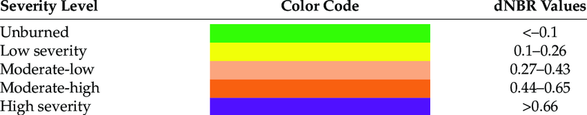
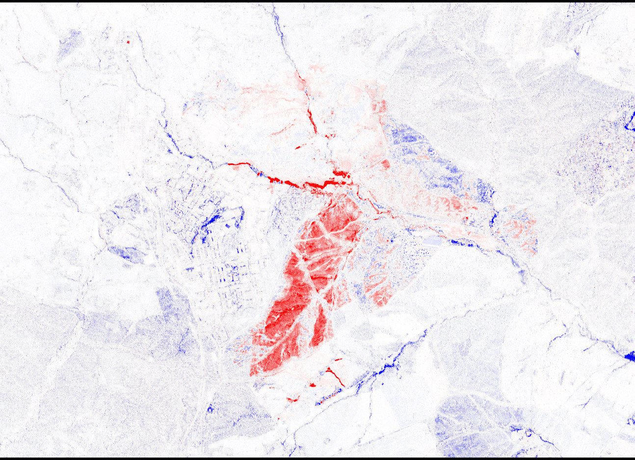
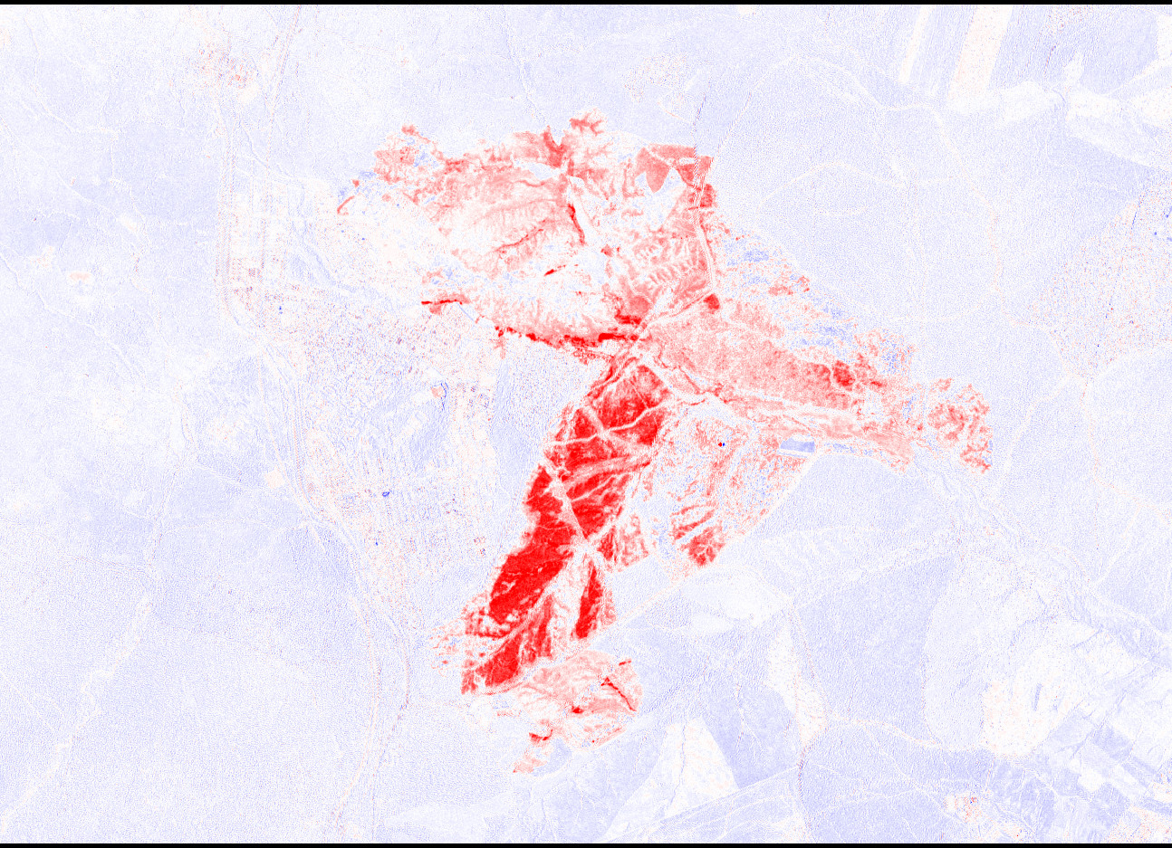
The following plot shows the areas for which dNBR >= 0.1 overlaid on top of a visible image of 2025-08-13. The colour coding is yellow for low severity, orange for moderate-low severity, red for moderate-high severity, and pink for high severity.
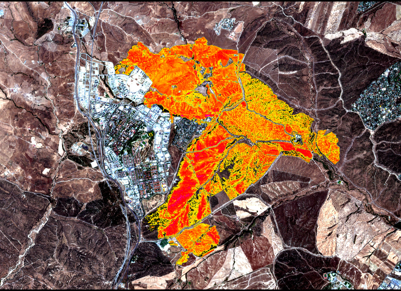
We see that the severity in the fields northeast of the city, which are mostly covered by dry grass, ranges between moderate and moderate high. Inside Monte de Viñuelas there are large areas of moderate-high severity, and even some reaching high severity. But there are other areas where the severity ranges between low and moderate-low.
Vegetation indices
In the same way that the NBR compares NIR and SWIR reflectance to determine the burn severity, there are indices that compare NIR and visible spectrum to determine the density and health of vegetation. The simplest index is the ratio vegetation index (RVI), which is defined as NIR/red, so for Sentinel-2 it is B8/B4. Another commonly used index is the normalized difference vegetation index (NDVI), which is (NIR-red)/(NIR+red), so for Sentinel-2 it is (B8-B4)/(B8+B4). Sometimes the red band is replaced by another visible band. For instance, the green normalized difference vegetation index (GNDVI) uses (NIR-green)/(NIR+green), giving (B8-B3)/(B8+B3) for Sentinel-2. There are a myriad other indices, some of which use the red edge bands B5, B6, B7, and some of which include calibration coefficients, but in this post we will limit ourselves to RVI, NDVI and GNDVI.
The following image is an RGB plot that maps RVI to red, NVDI to green and GNDVI to blue, with appropriate ranges for each channel. Brightness corresponds to the amount of vegetation, which is picked up by all the three indices. Differences in hue correspond to slightly different responses of each of the three indices, caused by different types of vegetation and perhaps other factors.
We can clearly see all the small creeks in this image, due to healthier vegetation surrounding them. The difference between areas that have trees and areas which are only dry grass is also quite clear, both in the brightness and hue. Individual large trees in sparse areas are also visible. Another fun thing is that artificial grass appears dark olive in this false colour view, so it is easy to look for football fields with artificial grass.
2025-08-10 RGB(RVI, NDVI, GNDVI) (false colour combination of vegetation indices)
The next figure shows the same kind of plot (with the same scale) for the 2025-08-13 dataset.
2025-08-13 RGB(RVI, NDVI, GNDVI) (false colour combination of vegetation indices)
Areas of trees inside Monte de Viñuelas that have been burnt completely by the fire are now very dark. All these trees have been lost. Interestingly, large parts of the dry grass fields still have a very similar dark blue hue. This is because the vegetation indices are intended to measure healthy green vegetation, and they give lower values for dry vegetation and soil without vegetation.
The differences are more clear in the following animated GIF, which toggles between the two images. We can also see that there are parts where the creek vegetation has been completely lost, and others where it has survived.

In a certain sense, this comparison of vegetation indices gives better assessment of the fire impact on the vegetation. Dry annual grass that has been burnt will grow back when the rain arrives in the fall, while trees that have burnt will take much longer to recover. Of course the impact on the whole ecosystem is much more complicated than this.
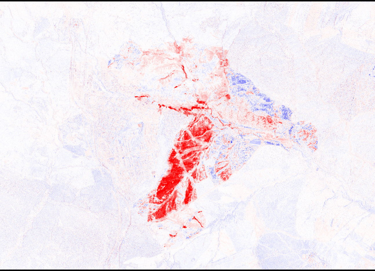
Let us now look at the change in these vegetation indices by plotting the difference between the index after the fire and the index before the fire. The following plot shows dRVI, the difference in RVI. Negative values (RVI has decreased after the fire) are shown in red, while positive values are shown in blue.
We see that the dRVI highlights a large amount of vegetation lost in the Monte de Viñuelas woodland, as well as along creeks containing high vegetation density that have been severely affected by the fire. However, areas of high RVI that have been unaffected by the fire show a high increase in RVI (blue colour). For instance, this can be seen in the Central Park in Tres Cantos, and in creeks outside the fire area. This cannot be. I think that the problem is that since the RVI is equal to B8/B4, for high vegetation index areas the RVI is too sensitive to small changes in B4. Any such small change caused by a calibration error or any other effect will cause a large change in RVI. Therefore, the RVI is too simplistic and has some shortcomings. Likewise, some areas affected by the fire are also showing a negative RVI.
We now turn to dNDVI. This does not have the same problem as RVI. Areas outside of the fire show very little change in NDVI, as expected. However, within the fire area there are still a few areas that show an increase in NDVI. This does not make sense either. When doing studies of burnt areas it is possible to observe an increase in vegetation index in some burnt areas due to vegetation regrowth after the fire, but this happens on a longer timescale. It cannot happen in a few days. I think that the explanation for this effect has to do with how the NDVI is defined as (B8-B4)/(B8+B4). After the fire there will be a large decrease in reflectance in both B8 and B4. If B4 (visible red) had a relatively large reflectance to begin with because of predominantly dry vegetation, and if there is a lot of black soot decreasing the reflectance in the visible bands, then B4 might proportionally decrease much more than B8, and we will end up with an increase in NDVI.
Finally, we have dGNDVI. This is much better than dNDVI regarding lack of vegetation index increase in fire areas. I think that the main reason for this is that NDVI and GNDVI weigh differently dry versus green vegetation, since GNDVI is defined as (B8-B3)/(B8+B3), green vegetation, which typically has B3 larger than B4, will have NDVI slightly larger than GNDVI. On the other hand, dry vegetation has B4 larger than B3, so it will have GDNVI slightly larger than NDVI. In this way, it is more difficult for dry vegetation areas to have a increase in GNDVI because of the effect of soot on visible reflectance reduction, as the green reflectance is lower to begin with.
Of the three indices I have tested, I believe that GNDVI is the best suited to assess the impact of the fire on vegetation.
Putting everything together
I have put together the following false colour RGB plot to try to summarize everything we have seen in one image. Vegetation, according to NDVI after the fire, is shown in green. Loss in vegetation, according to dGNDVI is shown in red. Burn severity, according to dNBR is shown in blue.
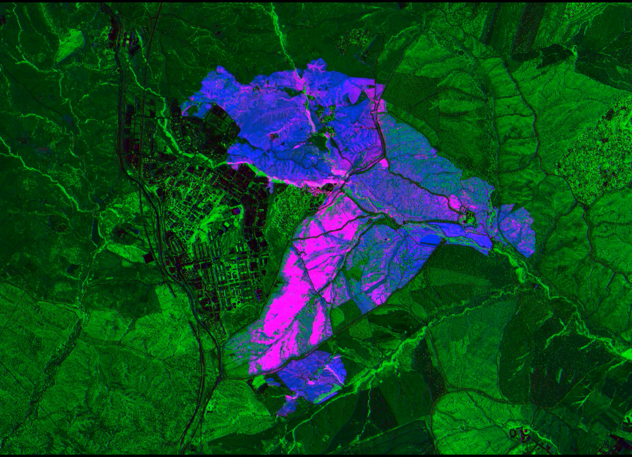
Badly burnt areas that had healthy vegetation appear magenta, as they both have high burn severity and high vegetation loss. Badly burnt areas that were only dry grass are blue, since they have high burn severity but low vegetation loss. There are no red areas, since that would imply high vegetation loss without high burn severity.
Areas that have lower fire affectation and still have healthy green vegetation are shown in a mixture of green and blue. The colour patterns in these areas look spotty, possibly due to grass clearings with burnt grass appearing blue and groups of oaks that are not burnt appearing green.
Conclusions
In this post I have shown how to use Sentinel-2 multispectral data to study the damage caused by the wildfire in Tres Cantos. I am amazed by the fact that the near infrared and short wave infrared spectrum have so much more information than what the visible spectrum can show.
From the Sentinel-2 data it looks like there are some areas of Monte de Viñuelas that have only been lightly affected by the fire, in particular, a strip near the wall bordering Tres Cantos is mostly intact. However, there is a large area of oak woodland inside Monte de Viñuelas that has burnt completely. Overall, the region with severe loss of vegetation, defined as that having dGNDVI is less or equal than -0.15, has an area of 3.66 km², while the area affected by the fire, defined as as that having dNBR larger or equal than 0.26, is 16.78 km².